A Data-Driven Case for Burlington's Best Kept Season
Working from Vermont’s tourism figures and Burlington’s hiking trails, cafés, restaurants, and attractions, iNStep designed and built an interactive digital experience that helps a prospective traveler discover what a fall weekend in Burlington could look like, then generates a personalized itinerary that takes the stress out of planning and allows them to plan a custom trip on the spot.
Project Type
Capability demonstration
Platform
Articulate Rise, extended with custom code
Demonstrated Capability
Adaptive itinerary personalization and custom visual design
Training Development
Delivery Management
The Need
Burlington, Vermont, draws strong visitor traffic for winter skiing and summer hiking, but that traffic drops sharply once fall arrives, even though the city offers a full slate of seasonal experiences, including foliage, harvest markets, and cozy cafés.
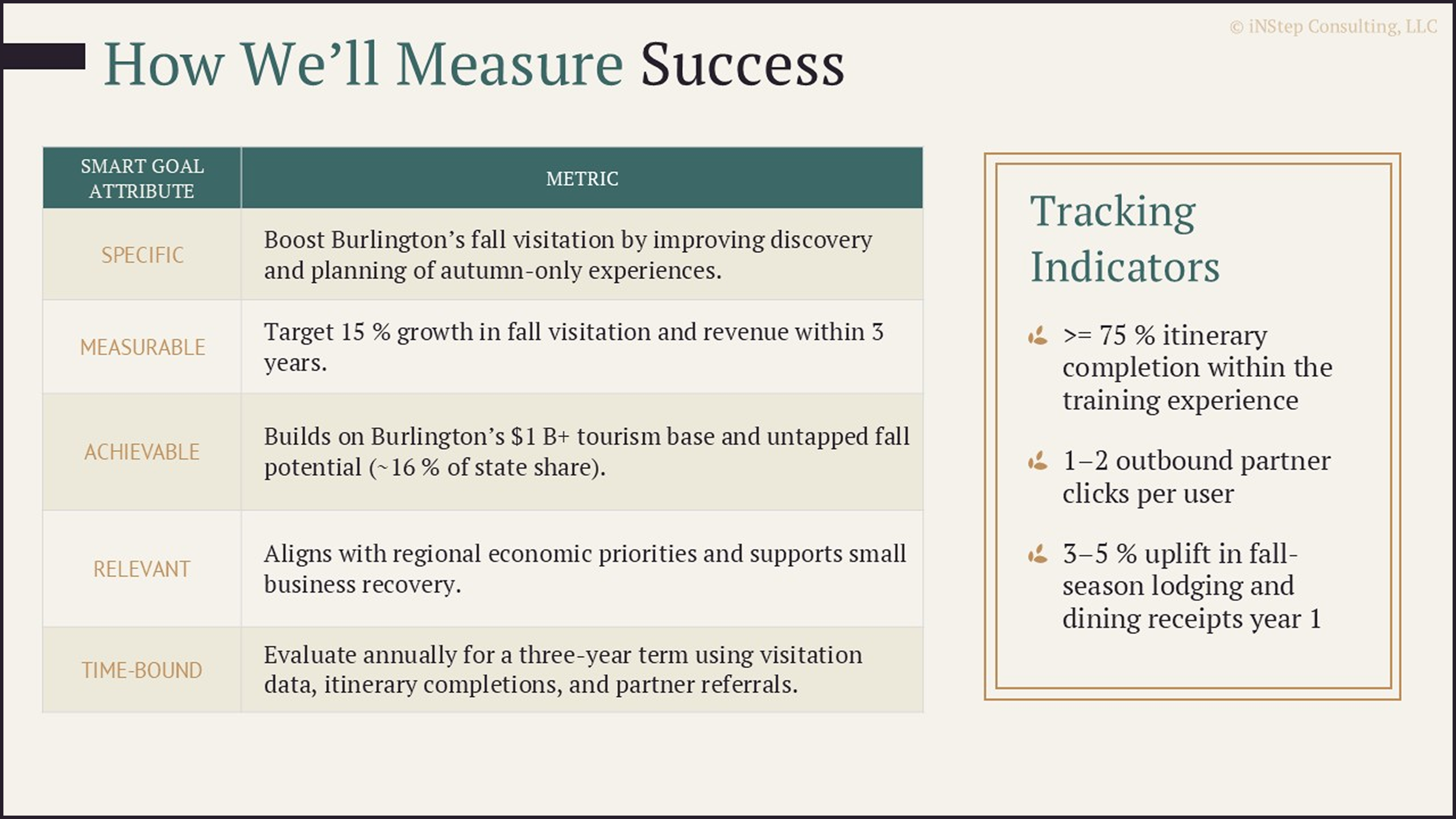
With Burlington accounting for a quarter of visitor spending in Vermont, the problem was not that people did not know it was there. However, tourism figures showed that only 16% of the $1 billion in visitor spending was earned during the fall shoulder season, compared with 48% in summer and 36% in winter. That sharp seasonal drop pointed to an opportunity for local shops, restaurants, and tour operators to capture more visitor activity during the fall shoulder season.
iNStep set out to explore how an interactive, personalized experience could make Burlington’s fall offerings more visible and move a prospective traveler from initial interest to a practical trip plan.
“
I expected to see the big fall events, but the itinerary also surfaced tucked-away picnic spots where we could take in the changing leaves. Those smaller recommendations made the trip feel personal, like we were discovering places we might never find on a large travel website.
Our Solution
iNStep designed a self-guided digital experience that carries a prospective traveler from initial curiosity about a fall trip through a complete, personalized weekend itinerary, structured as one continuous, webpage-like flow.
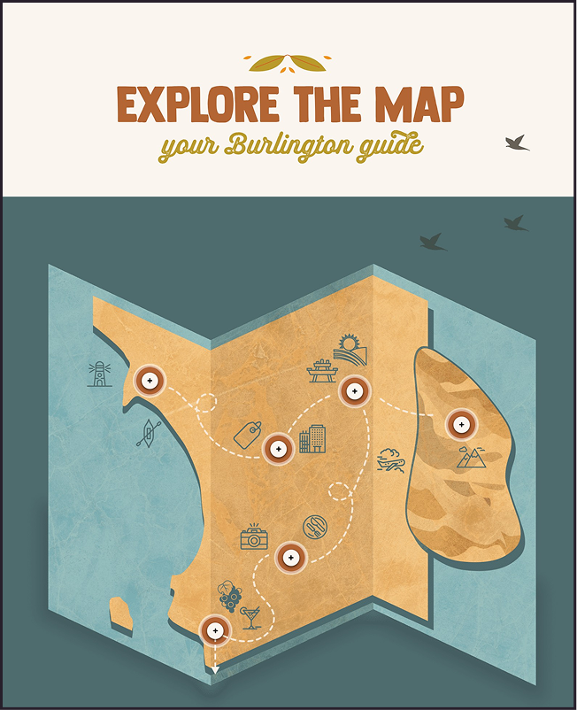
We organized fall highlights, local attractions, and food and drink options into sections that read like a travel guide, each one built from a Burlington-focused content library we developed.
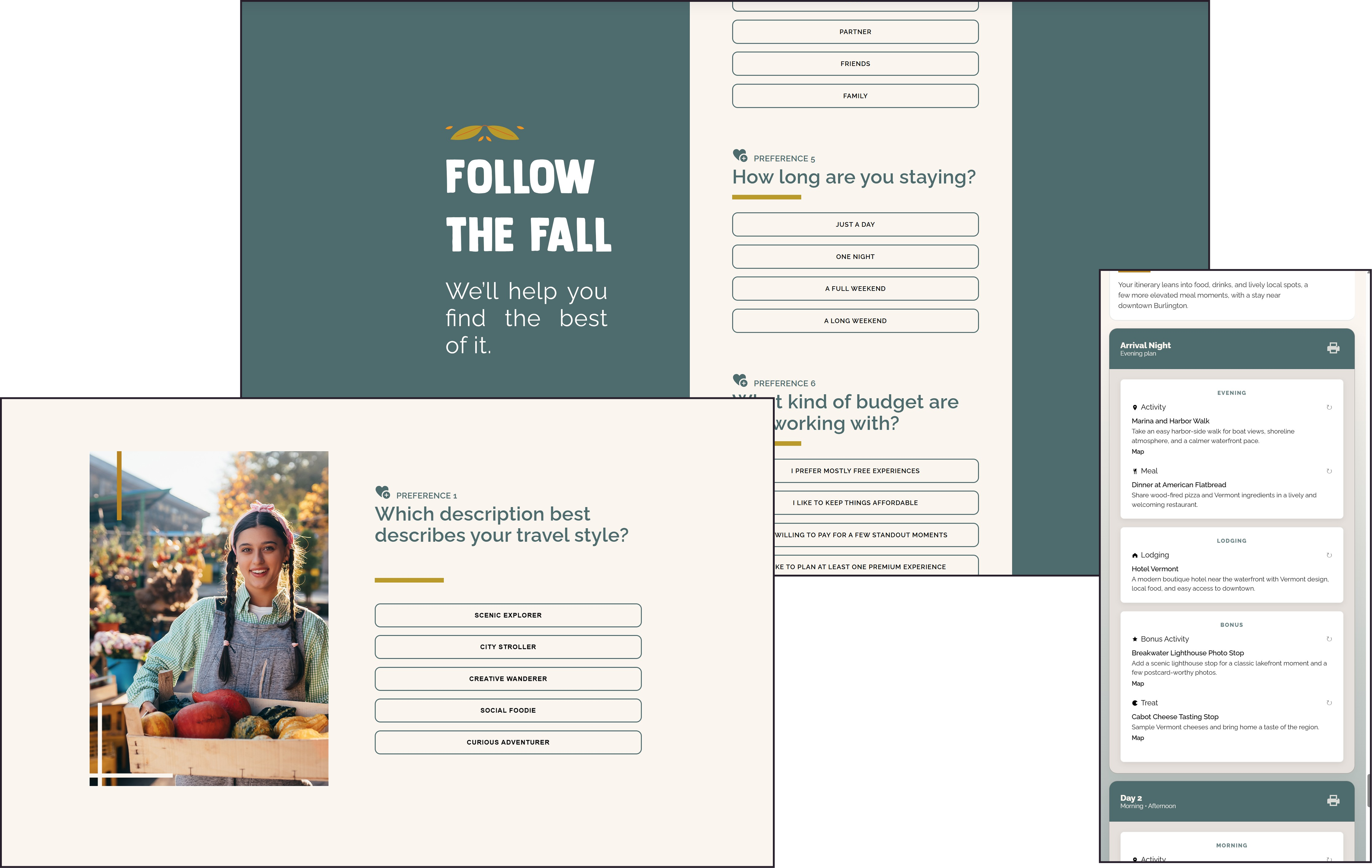
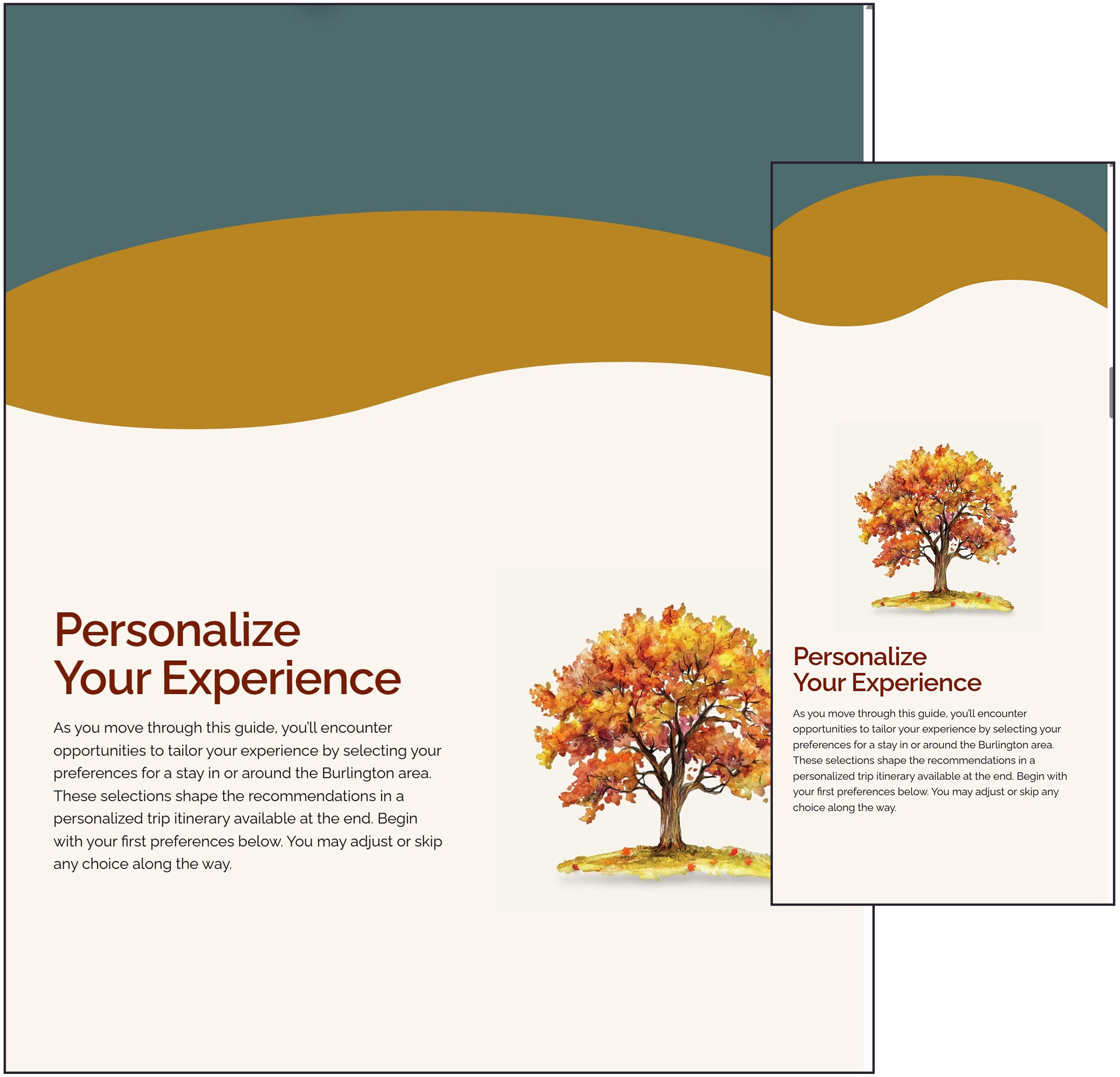
Along the way, we asked a small set of preference questions tied to decisions every traveler makes: how much ground they want to cover, what draws them in, and how they like to eat when they travel. We used their answers to personalize an experience that would lead them to the shops, activities, and eateries that matched the kind of fall trip they wanted to plan.
Our Process
Inside Our Approach
Understanding the user experience
Before deciding on a solution, we needed to understand who our audience was, what they were trying to accomplish, and how they approached trip-planning decisions. Although this project differs from traditional training, we used the same human-centered process we use to understand learners and the situations in which they need support.
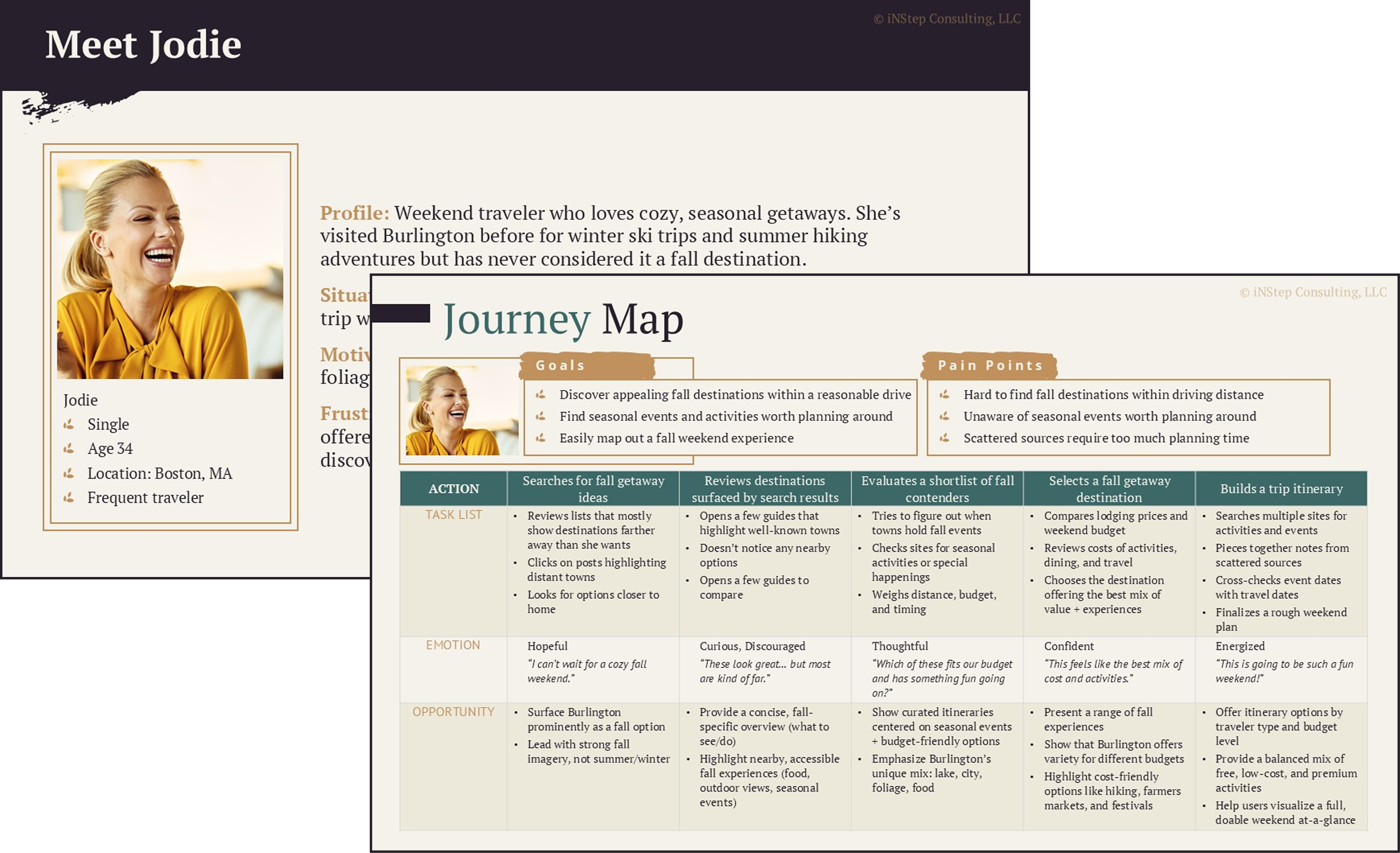
We started by creating a persona to represent our audience, or learners in a traditional training context. Our persona, whom we named Jodie, represents a realistic traveler planning a fall trip. We developed Jodie into a character with a busy life, competing demands, and a genuine desire to get away.
From this persona, we created a user story to capture what we felt would be Jodie’s primary goal when engaging with Burlington content:
As a prospective traveler, I want a simple way to find nearby fall destinations and events so I can plan a memorable weekend trip.
We then created a user journey that walked step by step through Jodie’s planning process, from her first search to the moment she would book a trip. This helped us identify opportunities to surface fall options in Burlington for Jodie to consider.
Turning discovery into a plan
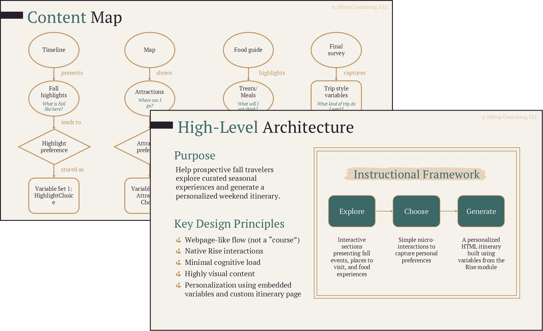
Walking through the user journey helped us land on key things a traveler might be looking for. We consolidated them into three key areas: fall highlights, such as fall foliage and seasonal hiking tours; attractions, including fall festivals and local museums; and food, including meals and seasonal treats.
We knew that other things would also play a key role in planning, including budget, length of stay, and the general interests of the traveling party. Was this a family weekend with the kids, a romantic getaway, or a fishing trip with friends? To motivate the user to stay engaged with trip planning, we needed to make sure they were seeing options that appealed to them and matched the kind of trip they were searching for. For that, we were going to need to create a highly personalized experience.
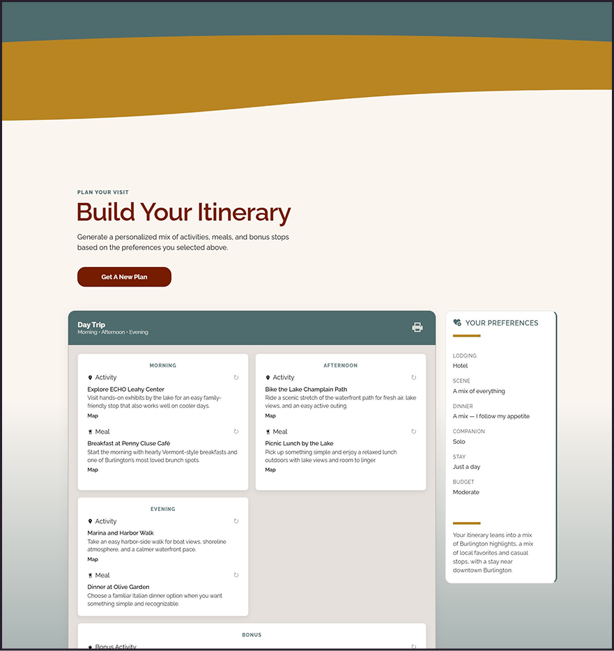
We also took into consideration that our persona, Jodie, was stressed and did not have a lot of time to spend on research and planning. We knew that if Jodie could leave the experience with an actionable plan in hand, she would be more likely to book a trip. We therefore decided to provide a personalized trip itinerary as the takeaway.
Our design was starting to take shape. We had refined our purpose, determined key design principles that would guide our decision-making, and created a repeatable instructional framework to organize the content and user flow.
We designed a repeatable “explore, choose, and generate” instructional framework based on the three main areas of interest we had identified in our user journey: seasonal highlights, attractions, and food. The “Explore” portion presented an interactive section that introduced area options. The user would then “Choose” a preference by responding to a question prompt. Their answers were saved and later used to “Generate” personalized results in the itinerary.
Key design principles included making the experience feel like a webpage rather than a course and using customized visual content instead of out-of-the-box interactions that favored a more traditional course design.
Inside the personalization engine
The key to tying the experience back to our business objective of promoting local businesses and attractions was creating a content library that could surface places matching the user’s interests.
We built a library that included hiking trails, cafés and restaurants, lodging options, seasonal highlights, and various places of interest. To connect each entry to the user’s search criteria, we added a tagging system. We tagged entries across several dimensions, including location, setting, and budget, so the system could filter, combine, and score relevant itinerary results.
Not every input carried the same weight. Some acted as firm gates: the system would not recommend an option that was incompatible with the traveler’s companions, budget, available time, or lodging needs. Other tags contributed to a softer scoring model, allowing especially relevant places to rise without narrowing the results so much that every similar traveler received the same itinerary.
We also organized the library into six geographic areas so the itinerary would function as a realistic plan, not simply a collection of individually relevant recommendations. We did not want the system to suggest breakfast in one part of town, an activity across the region, and then send the traveler back to the original area for lunch.
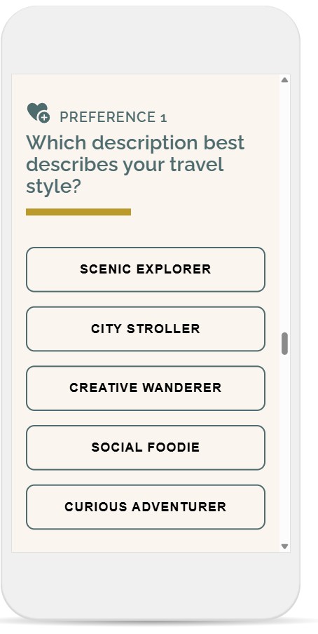
To help shape the overall composition of the itinerary, we grouped our users into five travel archetypes and asked a personalization question that allowed the user to select the one that most appealed to them for that trip-planning session.
The recommendations for each archetype focused on different types of experiences and centralized areas. For example, a Scenic Explorer drawn to hiking trails and lake views received recommendations centered on scenic and outdoor destinations, some of which offered picnic spots. A Creative Explorer drawn to arts and local dining received recommendations centered more heavily around Burlington’s arts district.
Each archetype pulled a different mix of offerings. Additional personalization questions allowed the system to select anchor experiences that held the day together and fit within the user’s budget and length of stay. Lodging, meals, treats, and other stops could then be arranged around those anchors and adjusted based on the traveler’s other preferences.
Two travelers could answer the same four questions and walk away with two different weekends.
Creating a travel experience inside Rise
Because this was a capability demonstration, the platform was part of what we wanted to prove. We could have built the experience as a standalone website, but that would not show whether this kind of adaptive, highly customized experience could be created inside a learning tool and delivered through an organization’s existing LMS. We chose Articulate Rise so the concept would remain applicable to more traditional organizational learning environments.
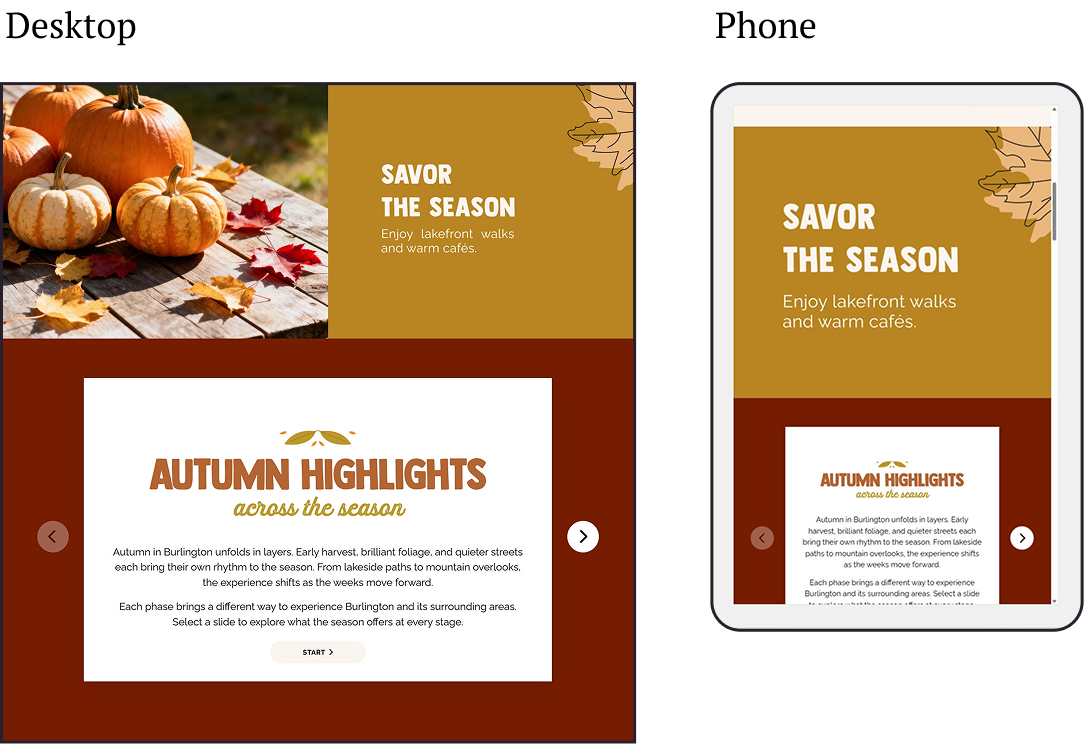
Rise gave us a responsive foundation and the continuous scrolling structure that matched the webpage-like experience we envisioned. However, its standard interactions still carried a recognizable course look and could not support all the functionality we had planned. We designed Burlington to blend traditional Rise functional blocks with custom HTML, CSS, and JavaScript, preserving its responsive framework and LMS compatibility while adding the functionality and visual control we wanted for this experience.
Rise natively keeps a button selection within the block in which it was made, so the value is not available to later blocks. Using JavaScript and CSS within custom HTML blocks, we designed our personalization questions and connected them directly to our content engine. Within those blocks, we stored each response as a session-level variable, retained the user’s preferences throughout the experience, and used those preferences to generate the itinerary.
We also handled responsive spacing, layout changes, and image behavior within custom blocks. For several section headings, we used graphics to retain the display style established in the visual design without relying on a web font that might not render consistently in Rise. Placing those graphics inside custom code removed the unwanted caption divider and allowed us to use one composition on desktop and tablet and swap in a better-proportioned version on a phone. Because the heading text was part of the artwork, we added descriptive alt text in the code so screen-reader users would still receive the same section cues.
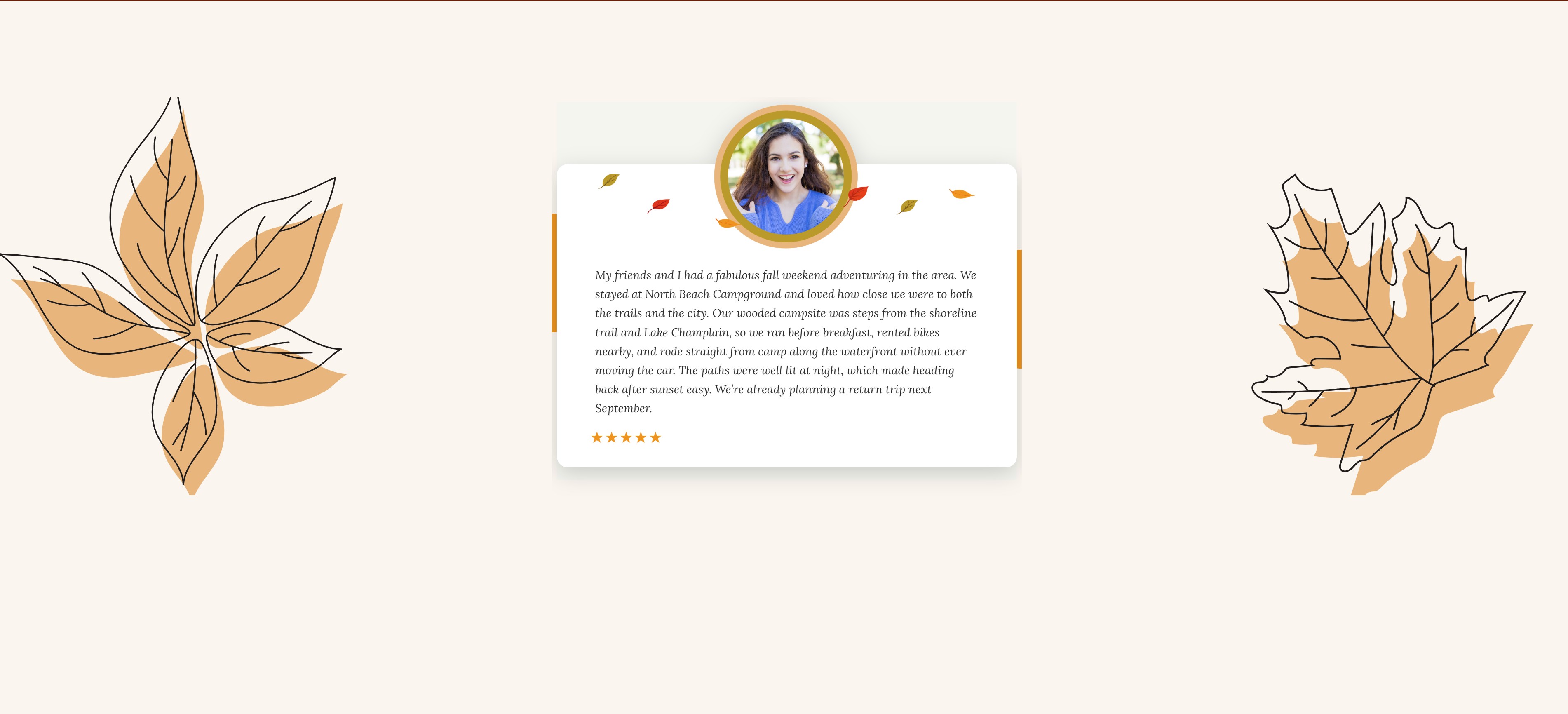
We added illustrative traveler reviews throughout the experience to make the recommendations feel more realistic and help users picture themselves visiting the featured activities and businesses. Each custom review block layered an illustrated avatar over the review card and incorporated full-width decorative graphics on larger screens, giving the testimonials a more distinctive presence while allowing the layout to simplify for smaller devices.
Maestro’s Mighty plugin created graphic transitions between selected sections, while responsive spacers built with JavaScript gave us precise control over the pacing of the page on different screen sizes.
Testing the experience and the engine
Once the experience was assembled, we needed to test more than whether the screens worked. We needed to know whether users could move through the experience without becoming overwhelmed, whether the personalization logic produced a realistic trip, and whether the final itinerary was useful enough to carry beyond the experience.
For a live tourism implementation, we identified measures that could be tracked in stages.
A 75% itinerary-completion target would show whether users remained engaged long enough to generate a plan.
Outbound clicks would indicate whether they continued to lodging, restaurant, and attraction websites.
Over time, changes in fall lodging and dining receipts could help determine whether that engagement translated into tourism activity. Because Burlington was developed as a capability demonstration rather than launched as a live tourism campaign, those downstream business outcomes remain proposed measures rather than results we could claim.
As a capability demonstration, we scoped this prototype to answer a specific question: could we build a functional adaptive experience inside Rise? Once the solution took shape, we developed the content library to support meaningful test combinations and confirm that the model was viable. A field deployment would expand that library and provide opportunities to validate and refine the tagging model using partner goals, live tourism information, and additional user data.
During usability testing, one of the clearest findings was preference-question fatigue. We originally included a question about treats and desserts, but testing showed that it asked users to make another decision about something that was not a major trip-planning priority. We removed it from the required flow and repositioned treats as bonus recommendations based on the traveler’s location. This allowed us to continue promoting local cider, maple, bakery, and dessert stops without making the user work harder to receive them.
We created test combinations across the saved preferences and reviewed the resulting itineraries for relevance, variety, and practicality. This included checking that firm requirements were consistently honored, preferred experiences rose appropriately, and the geographic logic produced days a traveler could reasonably follow.
Geographic testing was particularly important. If someone selected a mountain resort, for example, the engine needed to favor nearby activities or group farther destinations into a clearly defined day trip rather than repeatedly sending the traveler between the resort corridor and downtown Burlington.
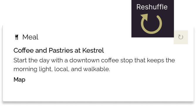
Repeated testing also exposed areas where the content library needed greater depth. When the same recommendations began appearing after several reshuffles, we expanded the inventory and refined the tags to create more useful variation. We then added targeted shuffle controls so users could replace an individual activity without restarting the itinerary or losing the preferences they had already entered.
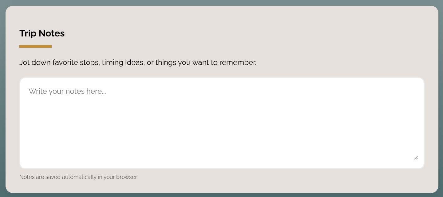
Finally, we tested what happened after the itinerary was generated. Users could add their own notes, make adjustments, and print the completed plan. These were not treated as extra features. They completed the experience by turning what the user had explored into something they could act on after leaving the page.
Beyond Burlington
The most transferable part of Burlington in the Fall is its content structure and decision logic. The prototype proved that we could build a functional adaptive experience inside Rise, carry user responses across separate blocks, and use them to shape later content.
Applied to training, the same tagging and scoring approach could organize content by role, department, experience level, task, or system access. A learner’s earlier response could determine the next scenario, assessment question, feedback, or supporting resource, allowing one experience to serve multiple audiences without creating a separate course for each one.
The supporting features transfer as well. The shuffle function can surface alternate practice, notes can capture reflection, and the printable output can become a personalized action plan or job aid. In Burlington, the result is a workable fall itinerary. In training, it could be an adaptive learning path with an actionable takeaway.